activities
UI Design
Webflow Development
Webflow Development
My Role
UI Designer
Front-end Developer
Front-end Developer
Overview
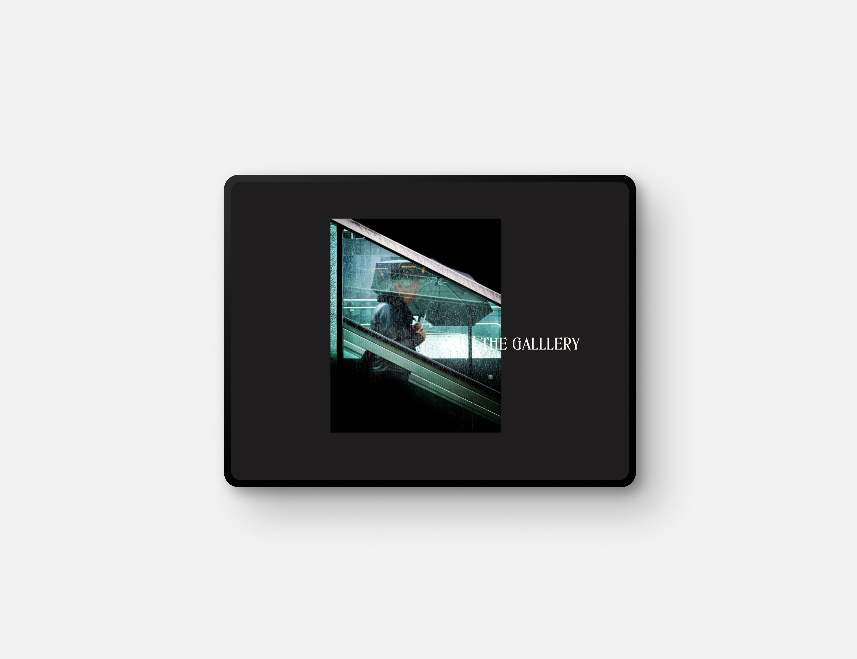
One of the first project freelance projects I had the chance to work on, was the creation of a portfolio website for Ingrid Clauwaert. She is a street photographer lately getting a lot of traction with her social media presence. Unfortunately she didn't have a personal portfolio website where she could let her audience see all of her photo's and origin story in a personalised form and style. So her next step was to get a platform to deliver her visual presence in a new professional way.
The challenge
During this project I got a lot of creative freedom from Ingrid Clauwaert the client. She had minimal requirements for the design & development of the website. She wanted the website to have a clean, elegant and simplistic look to keep the focus on her photography. This was perfect for me to try out new design trends and interactions that would fit her vision.
The portfolio website would be made in Webflow so that I could have the full creative freedom as a webdesigner to deliver the best visual experience.
The portfolio website would be made in Webflow so that I could have the full creative freedom as a webdesigner to deliver the best visual experience.

Project highlights
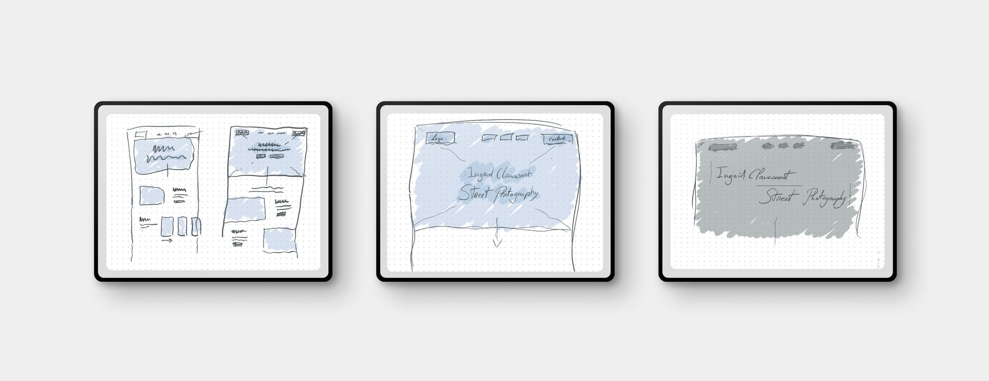
At the start of the project I had a client discovery session where I discussed all related topics I needed for the design process. What the goal is for the website, what online identity she wanted to define and what visual experience she had in mind for her portfolio website.
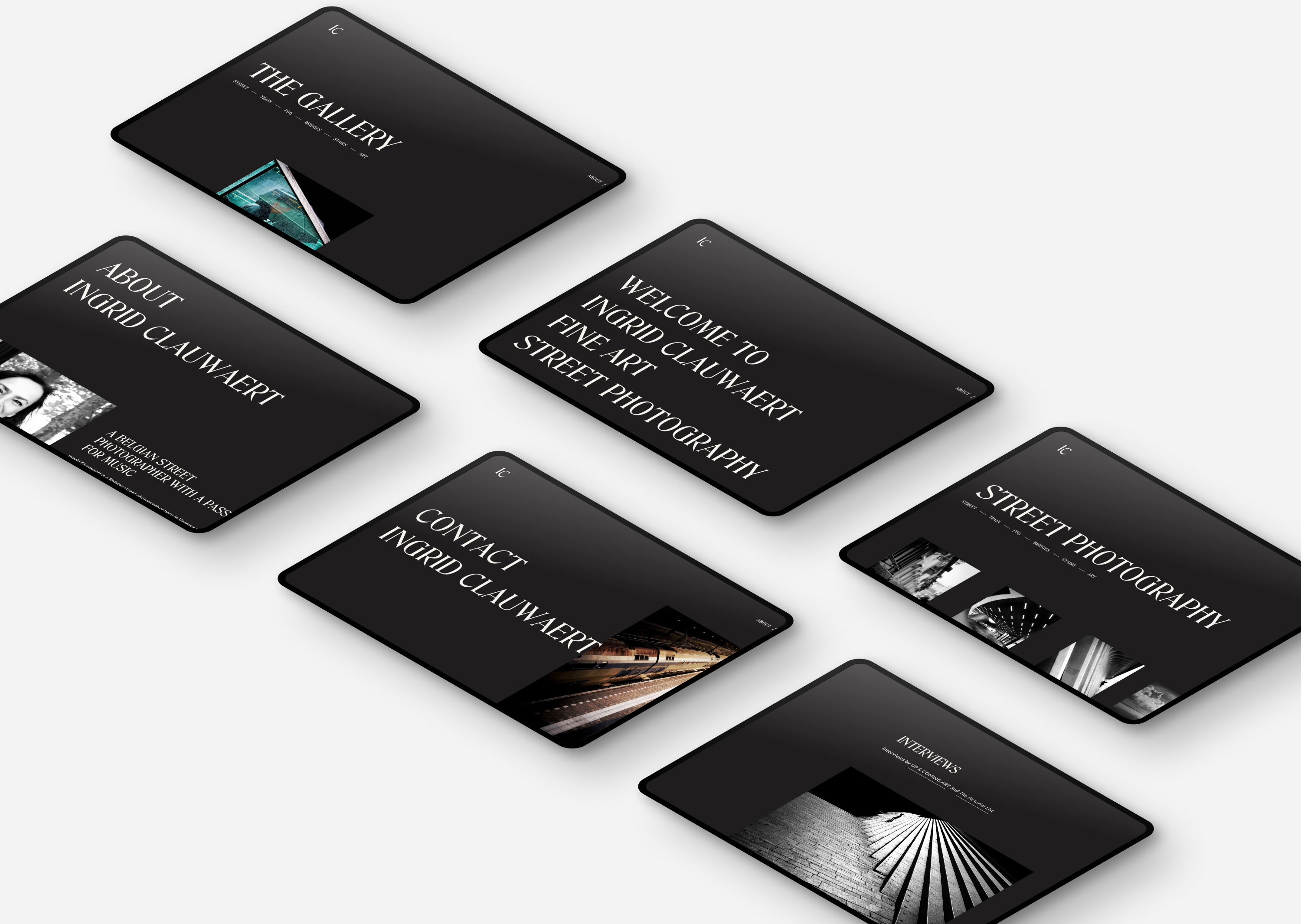
With the insights from the discovery session I had a direction I could explore. One theme she felt enthusiasm for was the feeling and experience of a cinema. So exploring design styles for darker themes could work really well. Looking at multiple design trends involving minimalistic & elegant visuals I finding a fitting experience for the portfolio. Ultimately I decided to go with an editorial styling for the portfolio website.
With the insights from the discovery session I had a direction I could explore. One theme she felt enthusiasm for was the feeling and experience of a cinema. So exploring design styles for darker themes could work really well. Looking at multiple design trends involving minimalistic & elegant visuals I finding a fitting experience for the portfolio. Ultimately I decided to go with an editorial styling for the portfolio website.

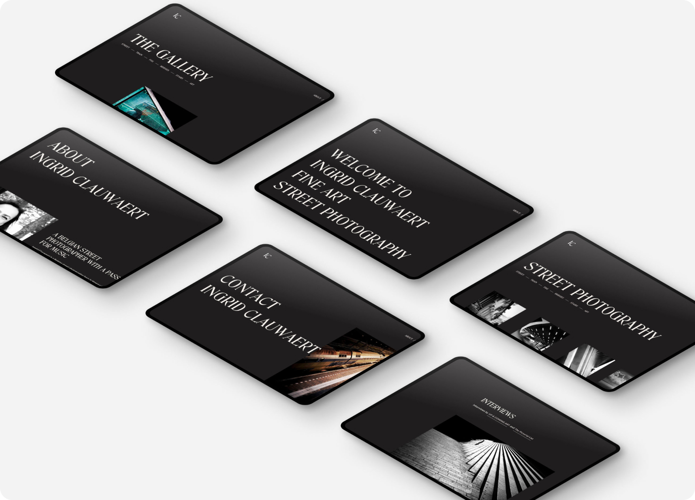
During the design and development stage I experimented with different layouts and compositions, trying to make use of the typography and photography contrast.After I defined the structure, layout and visual direction, I switched rather soon to the development phase in webflow. Using the power of webflow I could also experiment a lot with the interactive animations and set a better experience.
The delivery of the project was without complications, the client was very pleased with the end result and I learned a lot from the client interactions we had.
The delivery of the project was without complications, the client was very pleased with the end result and I learned a lot from the client interactions we had.

