activities
Digital Branding
UX / UI Design
Webflow Development
UX / UI Design
Webflow Development
My Role
UI Designer
Front-end Developer
Front-end Developer
Overview
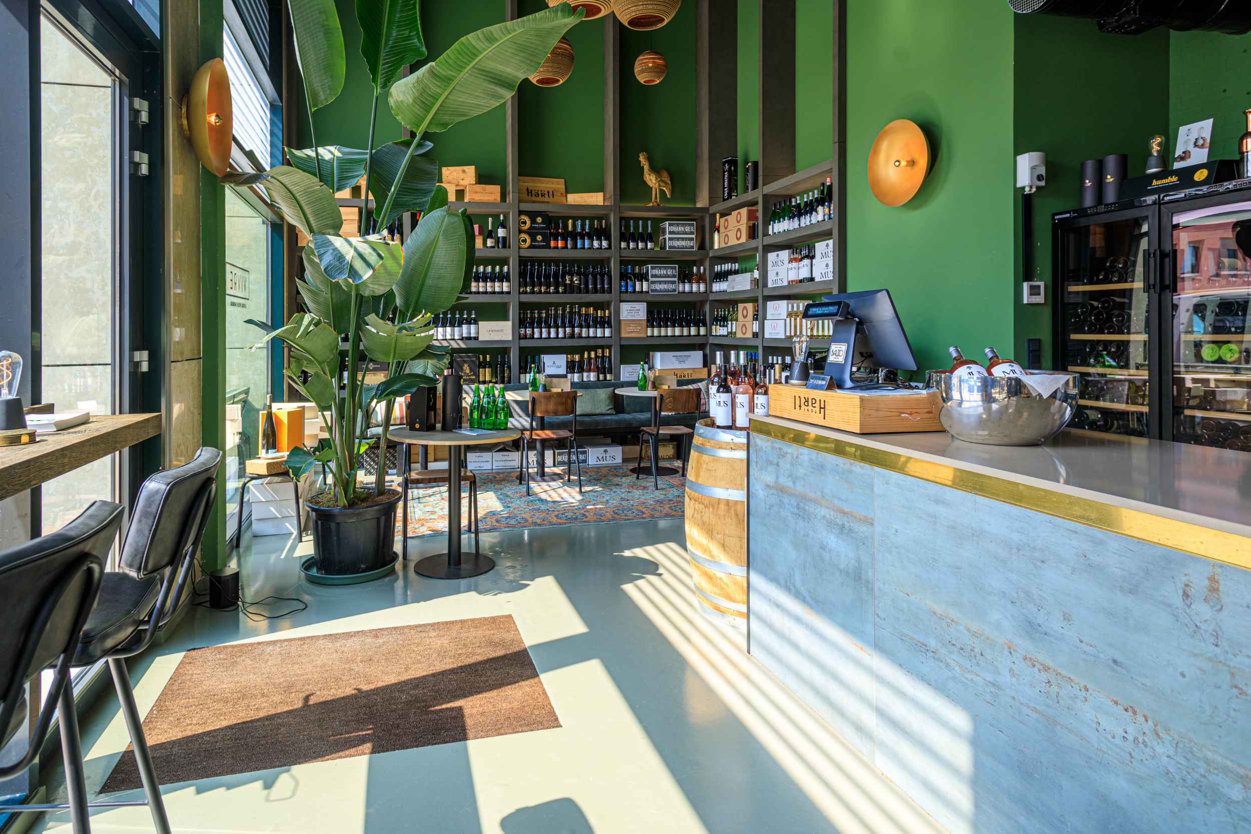
The wine bar Vivre located in an upcoming district of The Hague in the Netherlands offers exclusive wines, which are carefully selected by their owners. Careful selection is something within the DNA of Vivre, which you can experience within the ambiance and interior design of the bar itself. Next to offering great wines and pinsa's, they offer wine events for consumers and business clientele.
Project goal
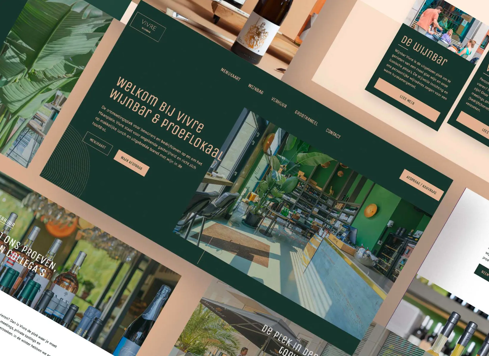
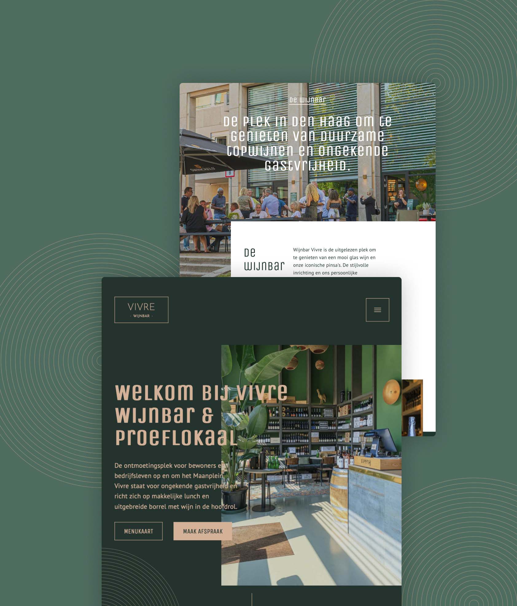
Translating the unique interior design of the wine bar into the redesign of their online identity and website.

Project highlights
At the start of the project I had a client discovery session where I discussed all related topics I needed for the design process. What the goal is for the website, what online identity they wanted and define their visual language.
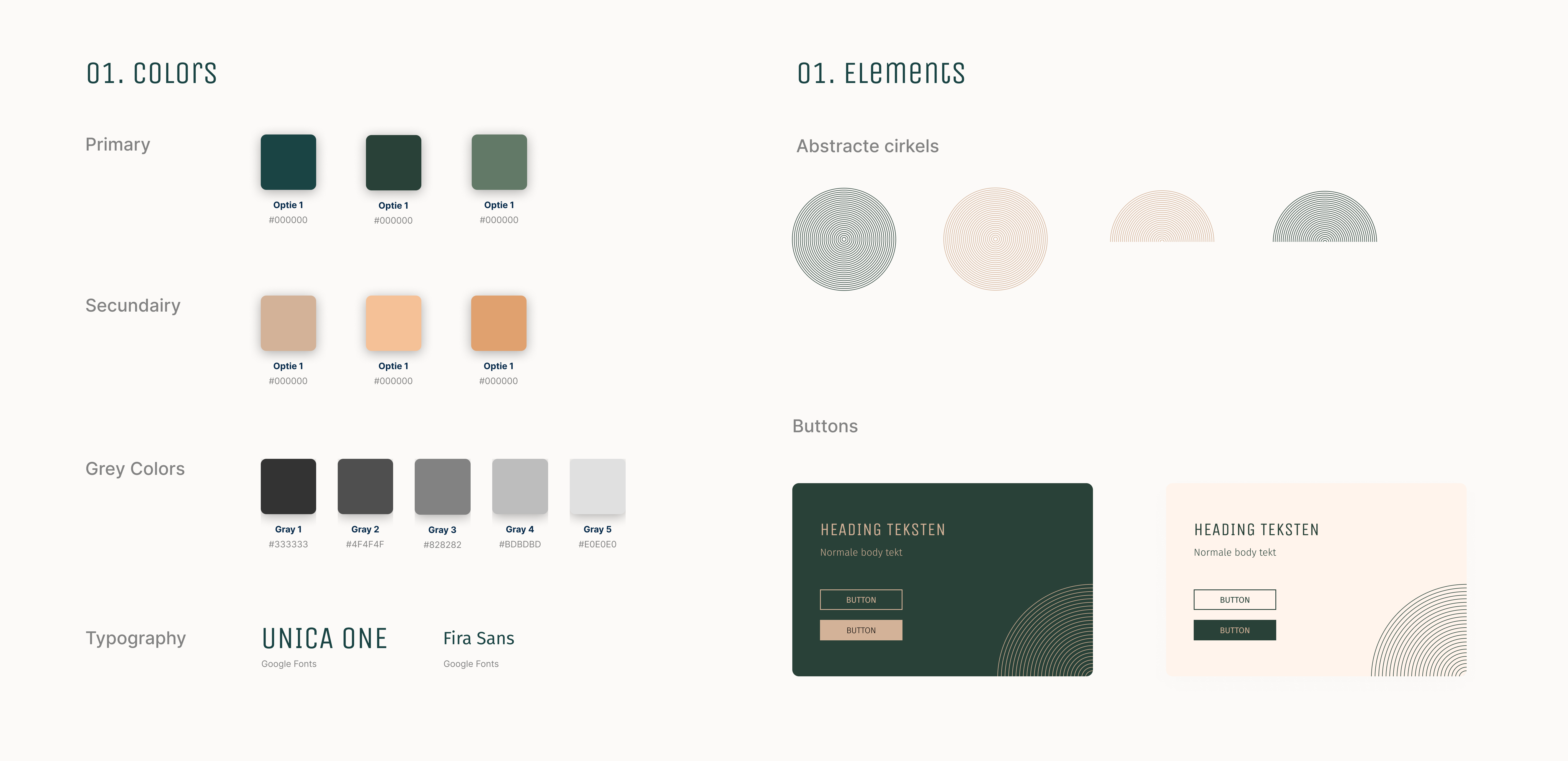
With the insights from the discovery session I had a direction I could explore. I created enthusiasm by looking towards their interior design and to use it as their identity of the wine bar. So exploring design styles of hotels and sustainable restaurants worked really well. Looking at multiple design trends involving minimalistic & elegant visuals was good starting point.
During the design and development stage I experimented with different layouts and compositions, trying to make use of the typography and photography contrast. After I defined the structure, layout and visual direction, I switched rather soon to the development phase in webflow. Using the power of webflow I could also experiment a lot with the interactive animations and set a better experience.


